A Flexbox Trick for Responsive Icon Screens
Here's a trick I just cooked up (well, it's probably widely known by, like, everyone on earth who regularly does css stuff, but I just discovered it for me, so I'll take a tiny bit of credit.).
Suppose you want to start off your site with an icon screen, like an iPhone or something. (I'm actually basing the design of my new website, in progress, on the old Palm Pilot home screen. Though I just moved away from the green, so maybe not anymore.)
Some devices have fairly wide screens, others have narrow but relatively long screens. If you have, say, six icons, it would be nice to be able to lay that out in two rows of 3 icons each on wide screens, and three rows of two icons each on narrow screens (like smartphones).
With flexbox you can do that, by setting up two layers of flex, and switching the direction within the layers.
Here's how. First, create an outer div, and then break up your icons (or whatever elements) into equally sized inner containers. Like this:
<div class="outercontainer">

<div class="innercontainer">
<img src="icon1">
<img src="icon2">
</div>

<div class="innercontainer">
<img src="icon3">
<img src="icon4">
</div>

<div class="innercontainer">
<img src="icon5">
<img src="icon6">
</div>


</div>
Then with your CSS, you'll set a breakpoint for small screens and a breakpoint for bigger screens, and in them, you'll switch the directions of the flex on the outer and the inner containers, as follows:
.outercontainer {
    display: flex;
    justify-content: space-around;
    align-items: stretch;
}

.bigsubcontainer {
    display: flex;
    justify-content: space-around;
    align-items: stretch;
}

/* wide screens */

@media (min-width: 700px) {

    .outercontainer {
        flex-direction: row;
    }

    .bigsubcontainer {
        flex-direction: column;
    }
}

/* narrow screens */

@media (max-width: 700px) {

    .outercontainer {
        flex-direction: column;
    }

    .innercontainer {
        flex-direction: row;
    }
}
How does this magic work? Well, the wide screen media query says "hey outer flexbox container, treat your children as columns." Since there are three children to the outer flexbox container, there are three columns. Then it says "hey inner flexbox container, treat your children as rows." Since each inner flexbox container has two children, it means there will be two rows. And vice versa for the narrow-screen media query.
The result:
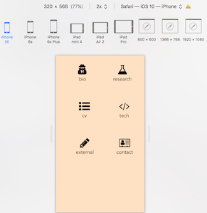
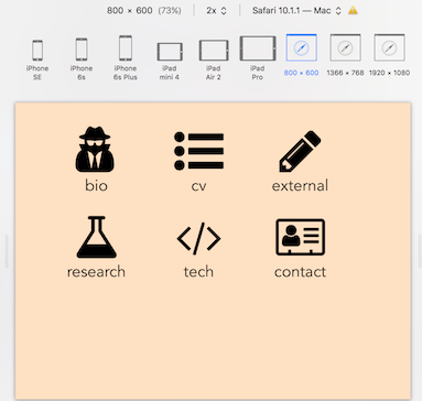
Complete control over the number of elements that appear in each row, with only a couple lines of code!